Panels Guide
Panels:
Image + Text Panel

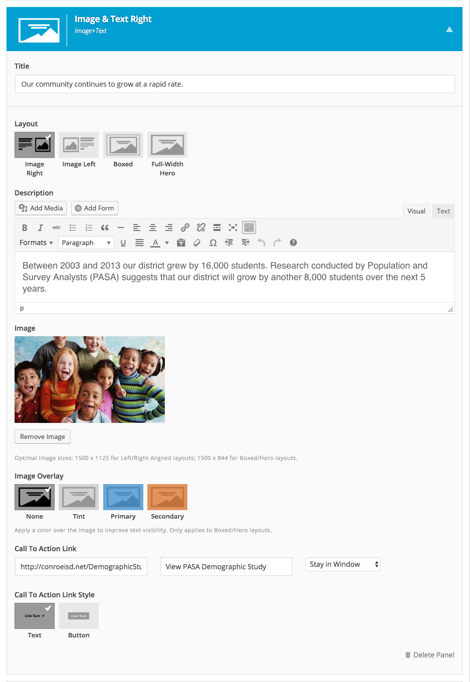
The Image + Text panel is one of the most effective tools for storytelling and/or informing your audience. This panels shines when the content focuses on singular theme or topic. Layouts range from the more immersive (Full-width Hero) to the highly scannable (Image Right & Image Left).
Layouts:
Image Right
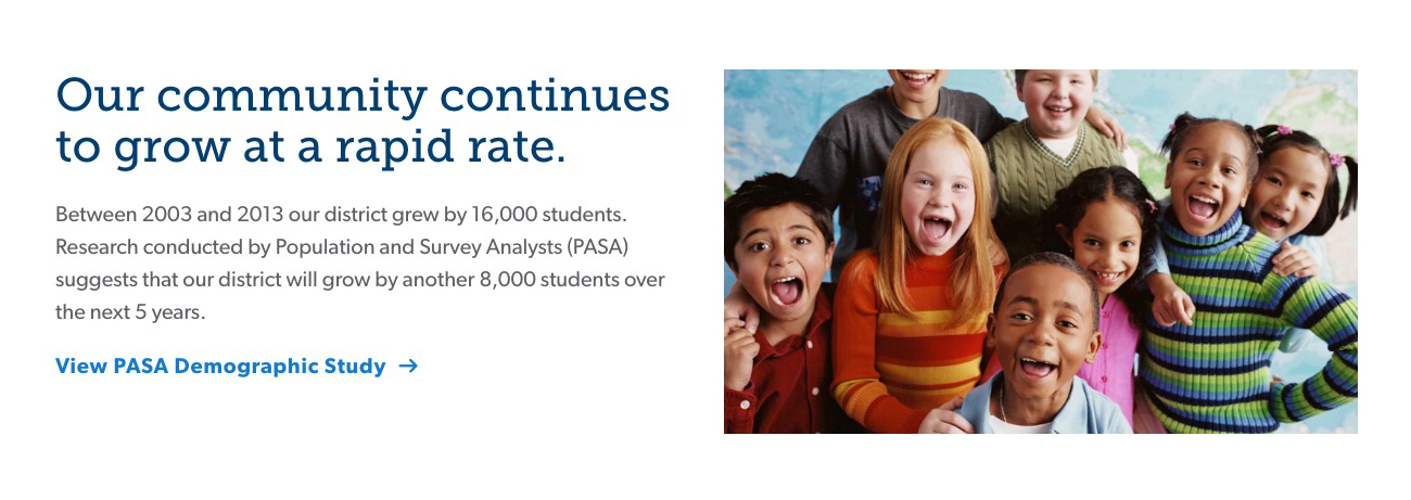
Image Left
Image is displayed on the left with text on the right. Similar to Image Right, image and text are bound to the content width of the site.
Boxed

Text is displayed on top of the image (overlayed). Similar to the Full-With Hero in every way except the image is bound to the content width of the site. Image tinting options are available to increase readability (Tint - darkens image) or for stylistic purposes (Primary or Secondary - tints the image these colors).
Hero
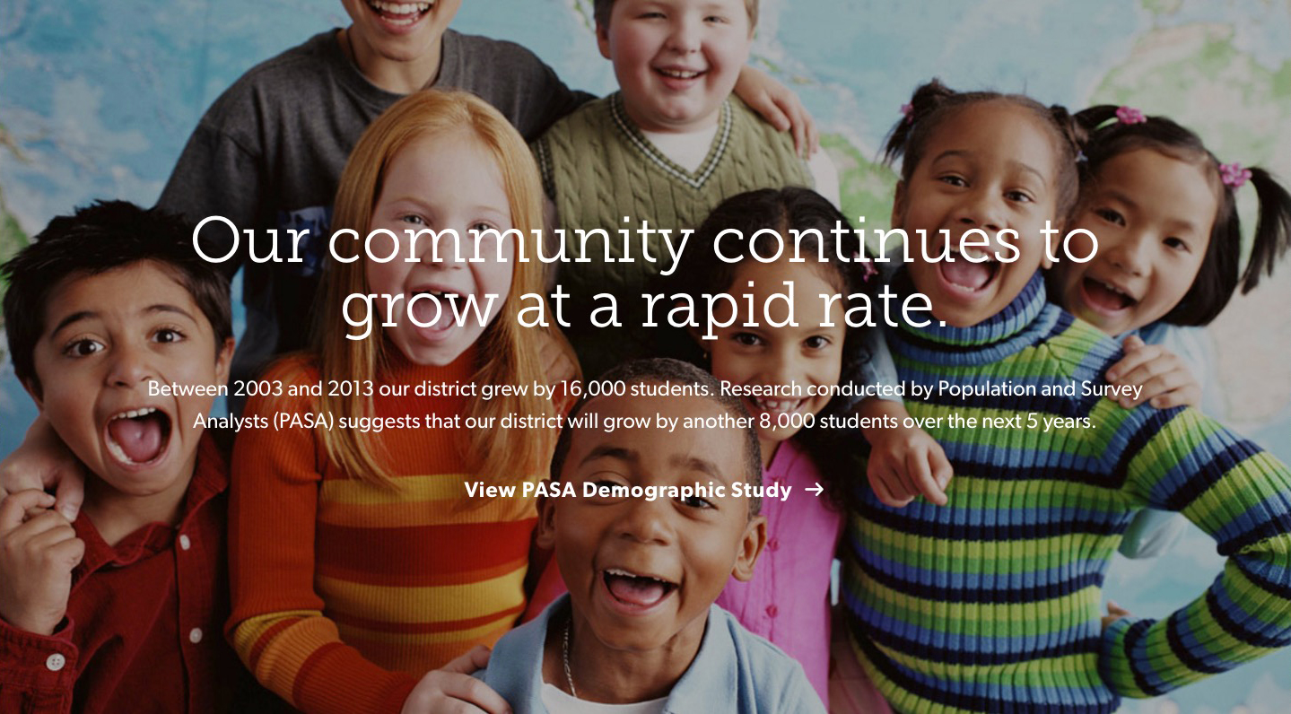
Full-With Hero breaks the content width of which the site is bound and fills the entire width of the browser. Image tinting options are available to increase readability (Tint - darkens image) or for stylistic purposes (Primary or Secondary - tints the image these colors)
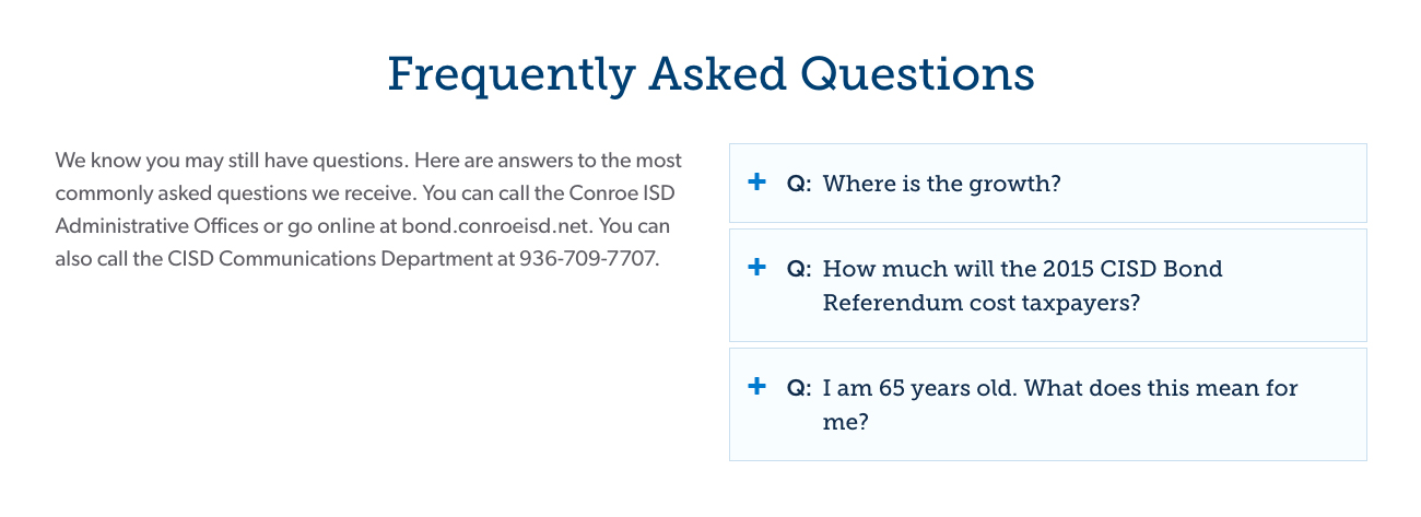
Accordion Panel
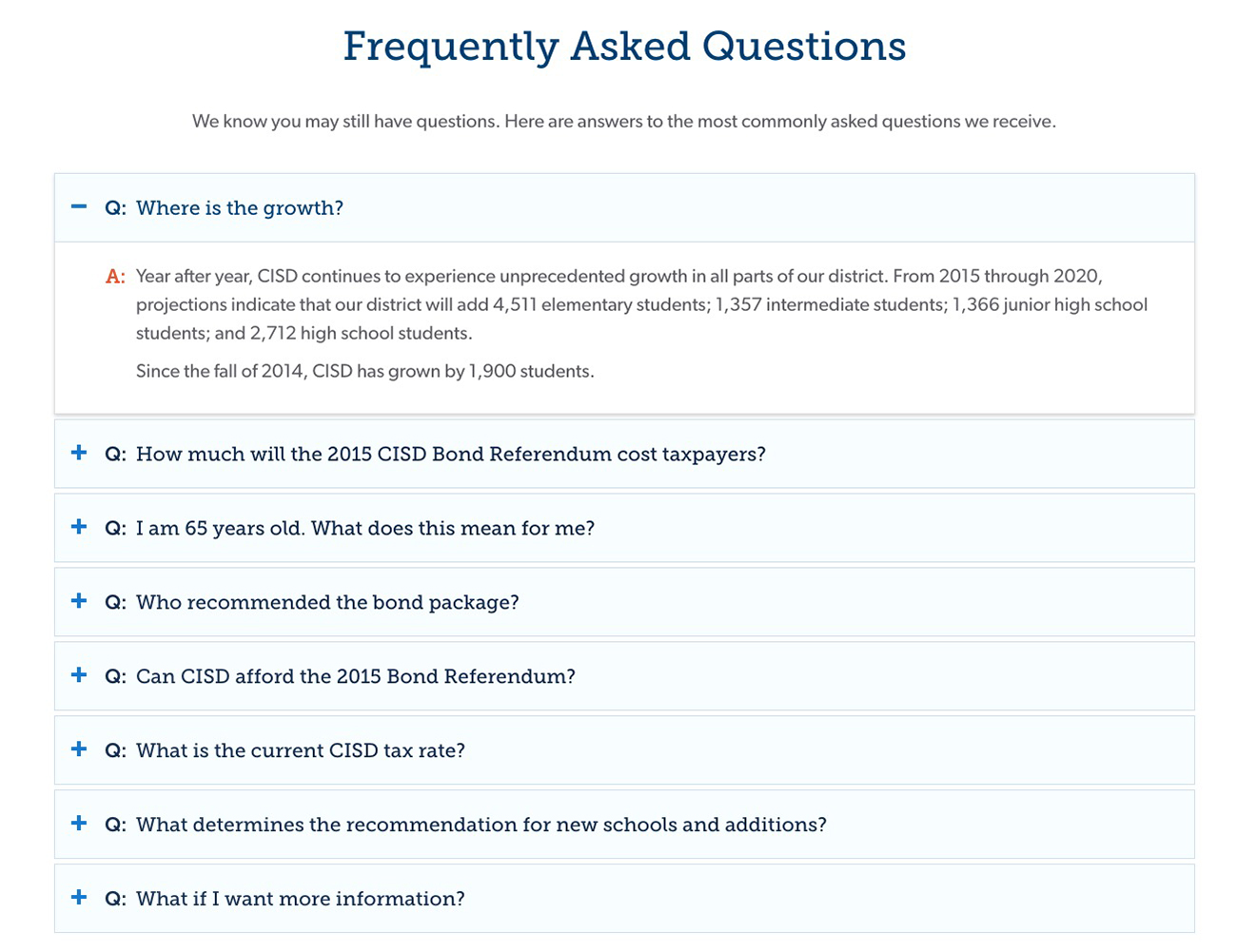
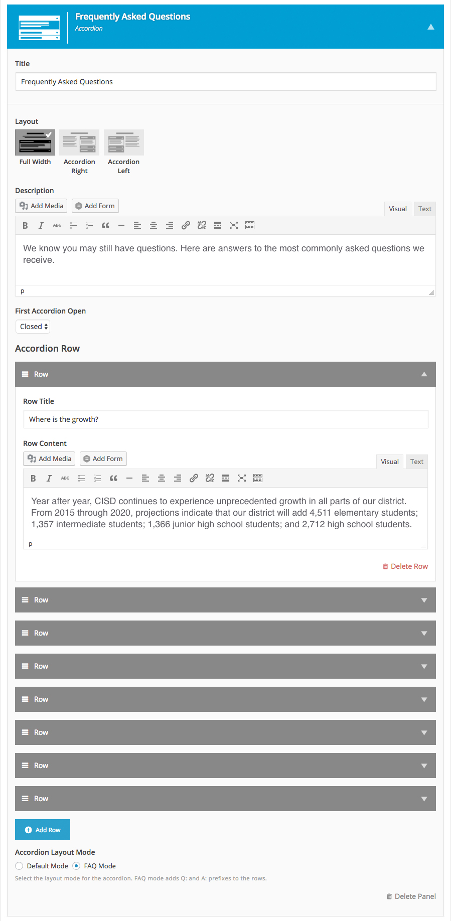
The Accordion panel is an effective tool to present text heavy sections in a focused, scannable and collapsable manner. In addition the Accordion panel can be used to house FAQs and long document lists.
Layouts:
Accordion Center
Accordion Left

Accordion Right
Title and the description are positioned to the left of the accordion.
Statement Panel
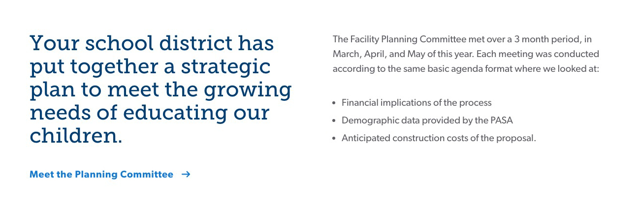
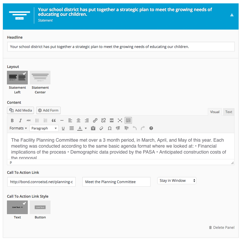
The Statement panel relies entirely on text to communicate your message to your audience. Best used to with a short title and no more than a paragraph or two of descriptive text, Statement will successfully communicate a single topic. Also, the Statement Panel is a delightful way to to begin a section or employed to break up a series of Panels that feature images.
Layouts:
Statement Left
Statement Center
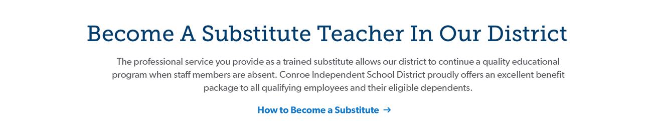
Title is positioned above the description.
Content Grid Panel

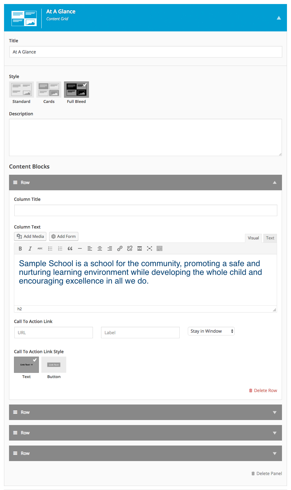
The Content Grid panel is a flexible framework (supports images & text) that can successful display content of a singular topic or conversely showcase multiple content items, which explore different topics. This panel supports 2–4 discrete content blocks and three layout options.
Layouts:
Full Bleed
Cards
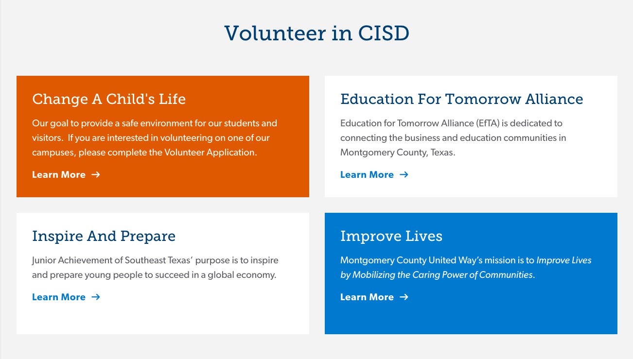
Content blocks are displayed in cards. The background color of the cards alternate between the secondary color, white, white and the secondary color. Cards are bound to the content width of the site.
Standard
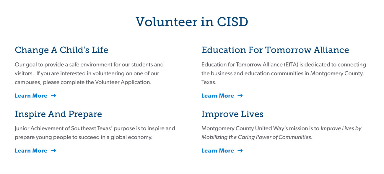
Content blocks are displayed on a white background and are bound to the content width of the site.
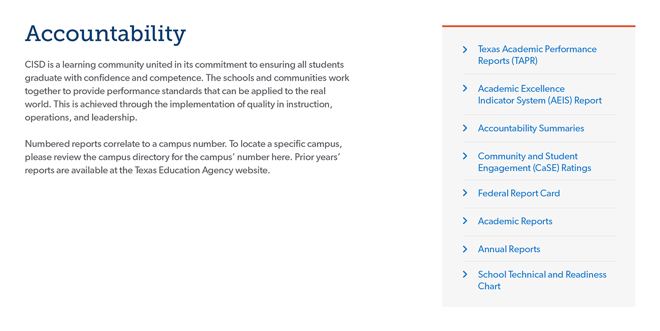
MicroNav Panel
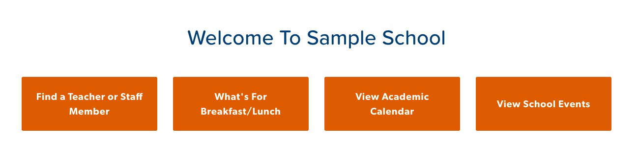
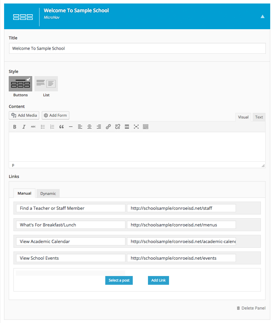
The MicroNav displays a set of links in a highly scannable and visually dynamic manner. Optional descriptive text can give additional context to the set of links. The MicroNav is perfectly suited to portal and section page, listing out the child pages or relevant related links.
Layouts:
Buttons
List
Content blocks are displayed on a white background and are bound to the content width of the site.
Events Panel
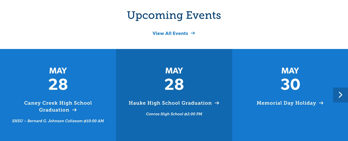
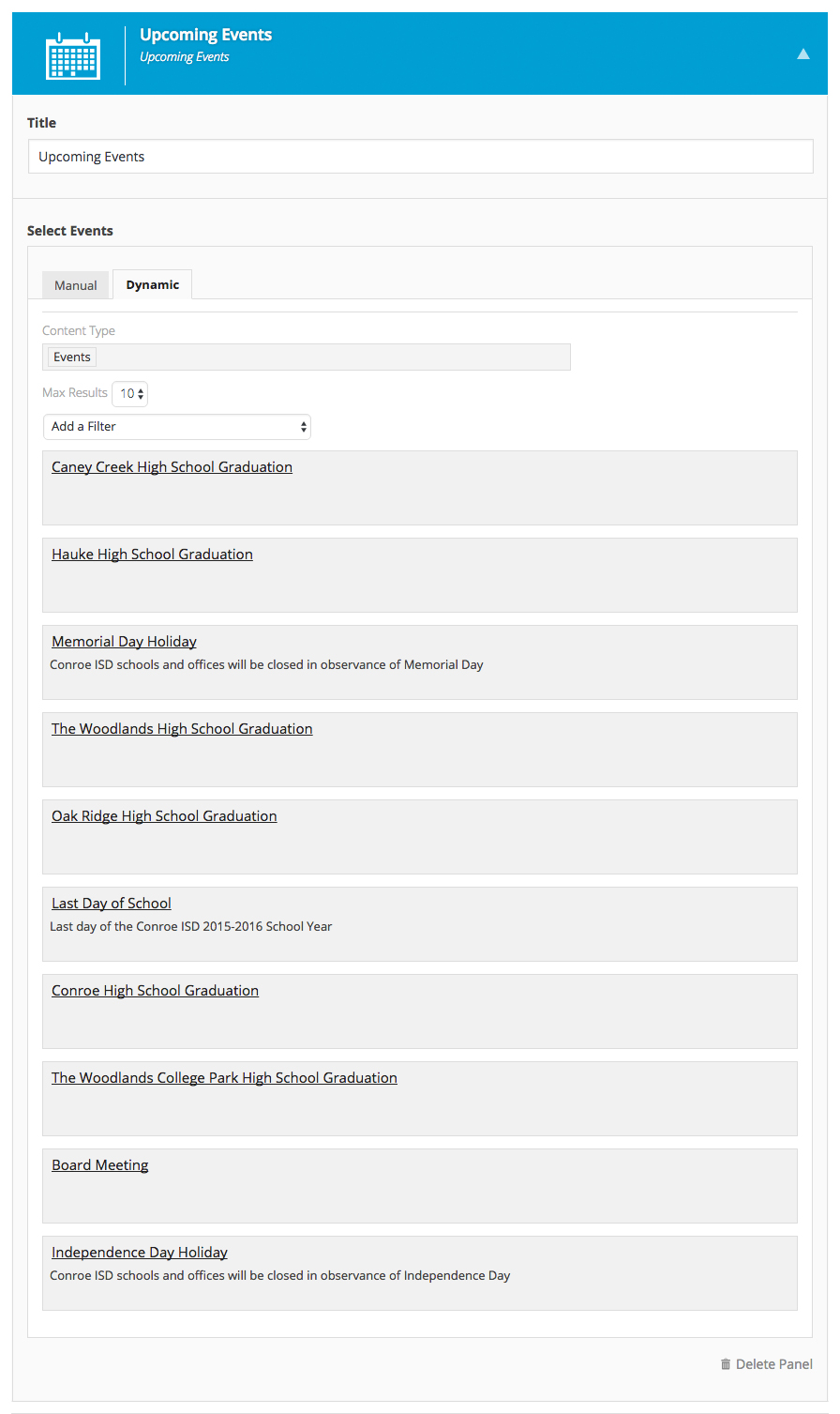
The Upcoming Events panel automatically pulls in Events created on your site based on the criteria you choose. Choose to display all upcoming events, events in a specific category or even hand select a few events you'd like to feature in this panel.
Directory Panel
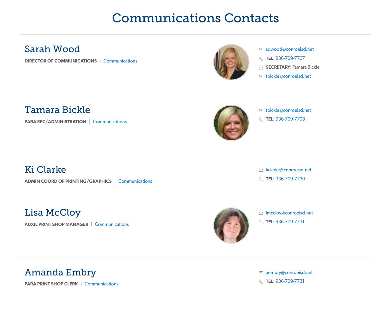
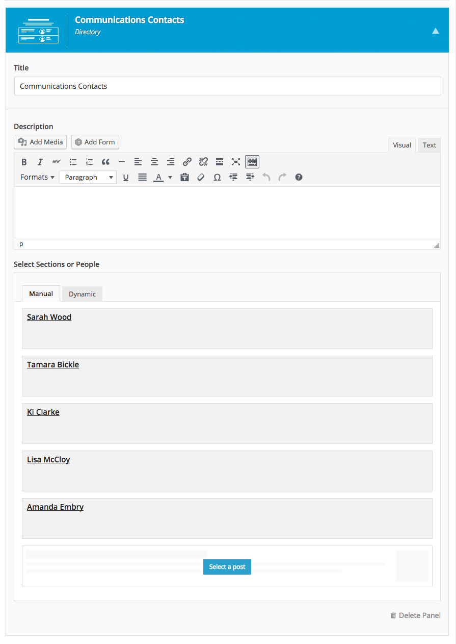
The Directory panels is directory list of people or sections. Each directory item supports relevant information specific to the individual or section (department, etc, etc, etc) such as image, title, contact details, etc.
Layouts:
Feature Panel
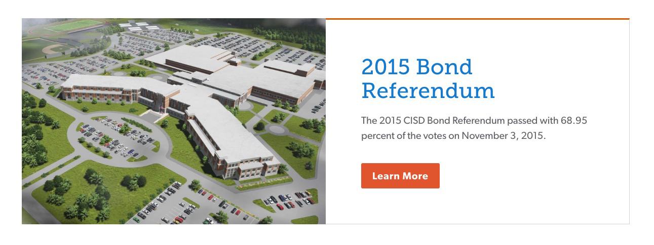
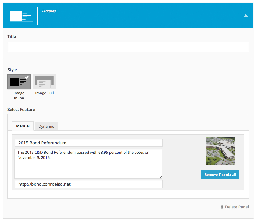
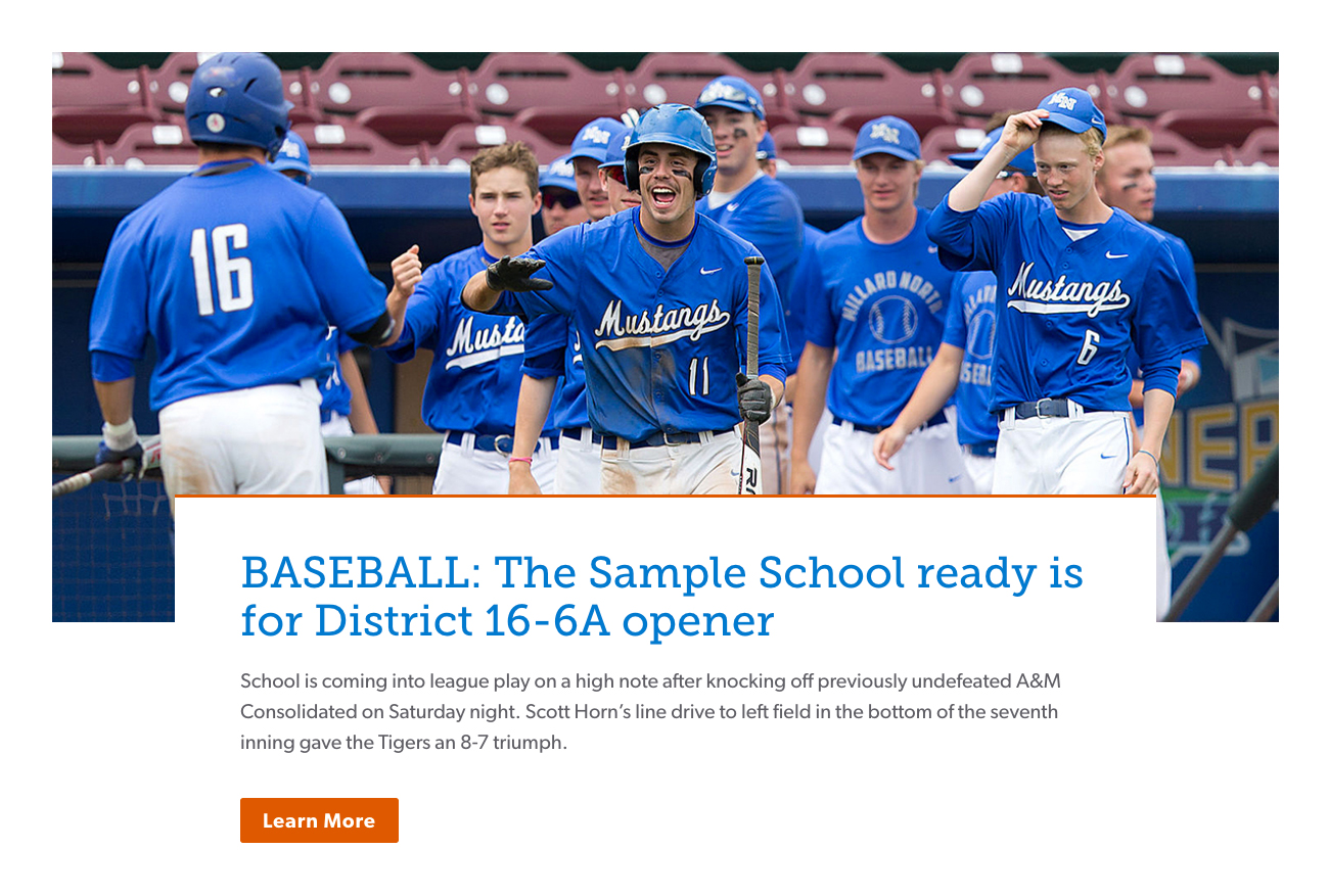
The Feature panel highlights a selected piece of content giving it more prominence on the page. This panel can be successfully used to promote an important upcoming event or even a successful student achievement.
Layouts:
Image Inline

Image Full
News Panel
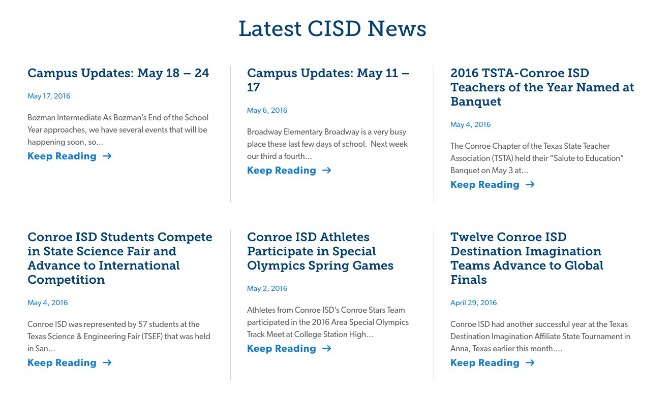
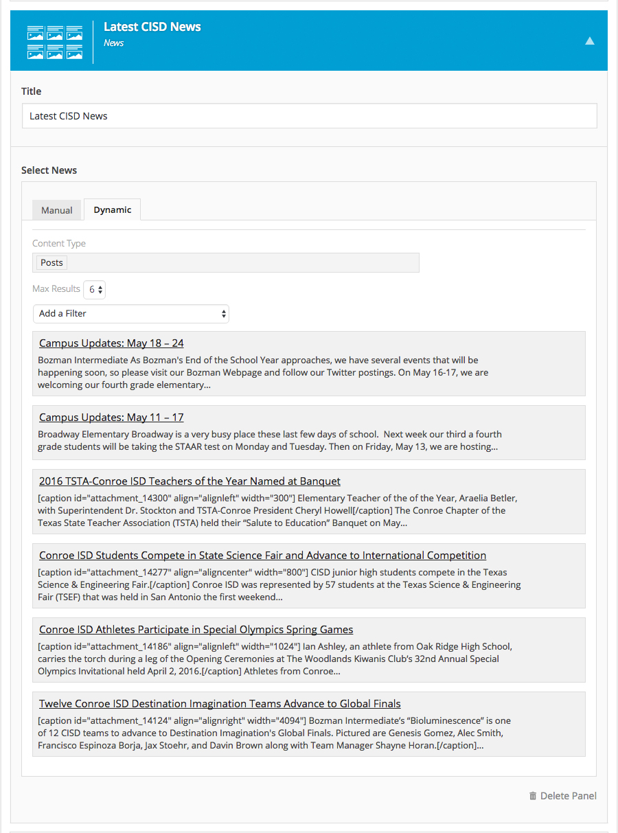
The News panel will display your Posts based on your criteria. You can display recent posts, posts from a specific category, or hand select specific posts to display
Gallery Panel

Display a gallery of images from your site's Media Library.